If there is one thing that Zwifters using the Apple TV have been able to agree on, it’s the frustration of trying to use the horrible Apple TV remote with the Zwift interface. While I think part of the blame can be placed on Zwift for not being better able to optimize their app for the hardware available, the Apple TV remote’s touchpad is notoriously difficult to use (as anyone who has tried to enter a complex password into and Apple TV app will attest) and is nightmare for Zwifters.
Trying to switch bicycles in the middle of a ride using the Apple TV is excruciating. Here I am, with a heart rate north of 160, trying to calmly scroll just one bike down in the list — and scrolling down three instead. Back up one, back up three, down two… and all the while other riders passing you by as you sit at the side of the road in your misery.
The Olympic biathlon should consist of Zwifting and using an Apple TV remote. That is far more difficult than aiming a rifle after cross country skiing at top speed for a couple of miles.
Alternative Remotes to the Apple TV remote

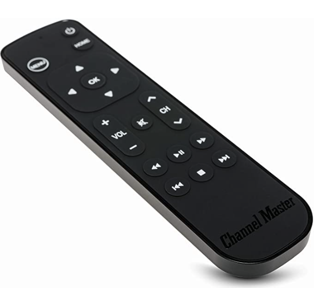
The first remote I tried to replace my Apple TV remote was the Channelmaster CM7000-XRC remote, which I was attracted to because it has honest-to-goodness arrow keys instead of a touchpad. My kingdom for an arrow key!
Unfortunately, this remote did not work with Zwift, and had trouble with other apps on my Apple TV as well. Basically, any interface that didn’t have items lined up in a very neat grid (like the Home Screen) was just too hard to navigate with the Channelmaster.
The Real Problem
Now that the Apple TV remote isn’t a complete design disaster, there is only one thing between Zwifters and being able to actually navigate the Zwift menus, and that is the Zwift menu interface itself.
The problem with the interface is that the UI elements are often stacked one on top of another, and there is no clear way to signal that you (the user) want to interact with an element or go to the next one. For example, there are many scrollable elements (selecting a route, a pace partner, a workout) on the menu screen, and although you can scroll up and down through the list, there are also UI elements below (and often above) the list. It becomes frustratingly difficult to navigate the list without accidentally navigating to those other items. With the new remote, you can “click” the outside wheel to navigate, but in Zwift doing so always selects the next UI element, not the next item inside the UI element you are working in. If Zwift could organize the elements so that they are in a grid (which is how Apple’s own on-screen interfaces all work), working within their menus would be infinitely easier.

Siri Remote for Zwift?
I was very enthusiastic to see that Apple had redesigned the remote for the new Apple TV, and put in my Father’s Day request right away (Happy Father’s Day to you all, BTW). I’ve just tried out and here’s what I found.
[sad trombone sound effect]
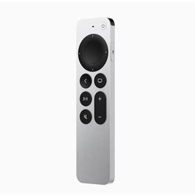
Unfortunately, the “click wheel” arrow buttons on the Siri Remote do not allow me to scroll through menus in Zwift, which was the one thing I was desperately hoping for. You can scroll up and down using the wheel (basically, the edges of this new, round trackpad), but there’s no way to go “up one” or “down one”, which is what we really need. I haven’t tried it out while actually Zwifting yet, so I can’t say if it works better than the old remote, but I can tell you that it doesn’t do the thing I really was hoping it would do.
As a small consolation prize, it does seem like a much better thought-out device. It has a better shape, you can tell the top from the bottom without really examining it too closely (unlike the old remote, which gave you a 50-50 chance of picking it up with the touchpad on top), and seems better in nearly every way. I should also say that there isn’t anything about this new remote that seems to get in the way of Zwifting, so if you go this route at least you don’t have to have one remote for Zwift and another for all the rest.
It’s up to you, now, Zwift
OK, Zwift, the ball is in your court. Apple just redesigned their remote, and it’ll probably be years before they do it again. You are our best bet now. Please find some way to allow us to pick routes, change bikes, etc, without the agony of the touchpad! How about a closet in the Zwift garage where I can put all those bikes that I’m never going to ride (who needs more than three or four bikes in this game?), right next to the fifty jerseys I’m never going to wear?
It’s a great game, and it’s been great watching it evolve over the last couple of years, but that doesn’t mean it hasn’t been frustrating, too.


Leave a Reply