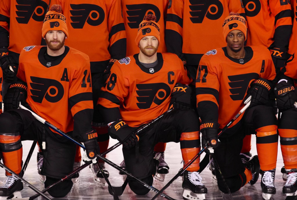
Word has reached my desk that the Philadelphia Flyers are getting new uniforms for next season. While this really seems to be a case of fixing something that doesn’t need to be fixed, it’s probably going to happen anyway, so I might as well let everybody know what they should do.
First, at least from the descriptions that have leaked, it seems that the Flyers at least have avoided doing something radical to their uniforms. While some sports teams in the past have made radical changes to their uniforms for better (exhibit a: The Tampa Bay Buccaneers in ’97), most changes —particularly those intended to modernize the look of the team— leave them worse off (exhbit a: The Tampa Bay Buccaneers in ’14). Uniform redesigns yield at least as many misses as hits, but a team can greatly improve their chances of at least not screwing it all up buy looking to the team’s history. That seems to be (if reports are to be believed) what the Flyers are doing.
(Aside: if the Flyers were interested in making a big change, they could do a whole lot worse than going with the Stadium Series uniforms from a couple years back. Those were excellent. )
The new uniform design hasn’t been released and I won’t comment too much on it until I get to see it, but I’ll tell you what I’d like to see the next go-round.
Arm stripes that can accommodate two-digit numbers: I’m not sure that widening the stripes on the arms (which is evidently part of the plan) is going to make the uniforms look better, but on today’s uniforms the numbers (except on the players with single-digit numbers, of which there are few) are wider than the stripes, and the overall effect looks like the stripe team and the number team didn’t talk to each other before the design was rolled out.
Numbers somewhere on the front of the uniform: I’m not in favor of adding things to the front of the jerseys (especially sponsor logos!), but it would be nice to have the player numbers somewhere on the front of the uniforms, like maybe one of the thighs. Right now, the only forward-facing number is the one on the helmet, and that’s too small to do much good for the spectator.
Smaller numbers on the back: Maybe after saying that we should put numbers on the front of the uniform and fixing the sleeve numbers it may seem like I’m contradicting myself regarding the numbers on the back, but I believe that the jersey numbers will actually become easier to read if they were a little smaller. At the size they are now, the are subject to wrinkling when tucked into (or, at least partially into) the player’s pants. Reduce the numbers by maybe 10 or 15% and I think that actually gets easier. At least worth trying out somewhere.
Color-coordinate the name plate: I’m not sure why the name plate is white or black on the current uniforms, but it feels like a leftover from the days in which you couldn’t apply the name directly to the jersey. I mean, it has a retro feel to it, I guess, but it seems like needless ornamentation. You can never go wrong simplifying things.
All this being said, nothing makes a uniform look good than putting it on a winning team. If that part gets fixed, then I think people will embrace the uniforms, too.


Leave a Reply