ACCT has been widely criticized from many sides for the conditions of the shelter and lapses which included procedural errors that led to (among other things) the mistaken euthanization of a dog put into their protective custody. Ultimately, a change.org petition demanding the removal of key leaders at ACCT Philly has garnered more than 34,000 signatures. This petition cites a number of failures at ACCT Philly.
In September, ACCT Philly posted something of a mea culpa on Facebook, acknowledging the disturbing findings of a then-recent inspection by the Bureau of Dog Law Enforcement, which went so far as to ask the PSPCA to investigate ACCT Philly for animal cruelty (stemming from unsanitary conditions in the kennel). Though the PSPCA’s report found that the problems at ACCT Philly did not rise to the level of animal cruelty, this did very little to mollify the critics, some of whom accuse PSPCA of being as dysfunctional as ACCT Philly and unqualified to act as judge.
Although many people that PennDog admires signed the change.org petition, PennDog did not. Although I try to educate myself as well as I can on these matters, I simply cannot say whether ACCT Philly will be better off under new management. I say this for two reasons:
First, although I do not know Ms. Velasquez, I do know many people in the animal welfare field and I have yet to meet a shelter director who was motivated by anything other than a deep desire to care for animals. Nobody does it for the money or the fame, because there is very little money and no fame at all. Nobody in shelter leadership has enough help, or money, or time to do everything they wish they could do for the animals in their care. To accuse a shelter leader of not caring about their animals is completely inconceivable to me. Of course, that doesn’t mean that every shelter leader is the best person for the job, or that some shelters wouldn’t benefit from a change in leadership, but it is far too reductionist to point at a troubled or failing shelter and assume that replacing the leadership will necessarily improve the situation.
Second, ACCT Philly has been for years woefully under-funded. In 2017, then-HSUS board member Marsha Perelman testified before the city council (with data) that “Philadelphia is the most poorly funded municipal shelter in America” and “dead last among major cities.” As Philadelphia’s only open shelter, ACCT Philly has essentially no control over how many animals they are tasked to take care of or the condition of these animals on intake. This is pretty much a worst-case scenario for a shelter — very little money and an essentially unlimited mandate to provide services. When a system breaks down, it is reasonable to ask whether even the best leadership could have prevented what has happened. I do not know the answer to that question, and I doubt anyone does.
Although the pandemic did lead to unprecedented rates of adoption for shelter pets (at least in the first year or so), the news has not been all good for animal shelters. COVID outbreaks among shelter staff are practically catastrophes, because one cannot simply shut down operations for a couple of weeks while everyone quarantines. Animals, too, are contending with their own epidemics and while you could argue that some of ACCT Philly’s failures contributed to the spread of disease in the shelter, it would be grossly unfair to suggest that they are at the root of the problem.
In the end, it is hard to know whether ACCT Philly will be helped or hurt by a changing of the guard. Surely, the situation today is terrible and everyone wants to see conditions improve. Will the next Executive Director have the right combination of knowledge and skills to right the ship and improve the lives of their animals? We can only hope so. Personally, I’d feel better if Philadelphia gave their animal control team (whether it remains ACCT Philly or another organization) funding on par with other cities even close to its size. On-par facilities with on-par funding would no doubt yield better results than finding even a superstar Executive Director and dropping them into the current environment. It is reasonable to ask if Ms. Velasquez and other ACCT Philly leaders could have done better, but we shouldn’t stop there.
Declawing is still a fairly common practice in this country, but in recent years opponents have ramped up their efforts to educate the public on the gory details of this surgery. Although it may seem to be analogous to maybe a extreme version of cutting one’s nails or perhaps the surgical removal of the nails themselves, declawing actually involves removing the last phalange of each toe — the equivalent of cutting of each of your fingers at the last knuckle. (as the Humane Society puts it, it’s not just a manicure.) Opponents say that this is needless surgery at best and may cause the cat residual pain and contribute to other problems down the line.
Like other cosmetic surgeries for animals, declawing is banned in most European countries. In Israel, declawing a cat can land you in jail. Things move more slowly in America (probably having something to do with “freedom”), and as of yet no state has banned declawing, though several municipalities (mostly in California) do have bans in place. Among the groups fighting a ban are some veterinarians who, of course, profit from performing declawing procedures.
Although Pennsylvania can boast perhaps the country’s oldest animal rights organizations, it would be a stretch to say that it is often out in front of efforts like these. Penn Dog congratulates Pittsburgh on its leadership and hopes that the rest of Pennsylvania will follow.
If there is one thing that Zwifters using the Apple TV have been able to agree on, it’s the frustration of trying to use the horrible Apple TV remote with the Zwift interface. While I think part of the blame can be placed on Zwift for not being better able to optimize their app for the hardware available, the Apple TV remote’s touchpad is notoriously difficult to use (as anyone who has tried to enter a complex password into and Apple TV app will attest) and is nightmare for Zwifters.
Trying to switch bicycles in the middle of a ride using the Apple TV is excruciating. Here I am, with a heart rate north of 160, trying to calmly scroll just one bike down in the list — and scrolling down three instead. Back up one, back up three, down two… and all the while other riders passing you by as you sit at the side of the road in your misery.
The Olympic biathlon should consist of Zwifting and using an Apple TV remote. That is far more difficult than aiming a rifle after cross country skiing at top speed for a couple of miles.
Alternative Remotes to the Apple TV remote
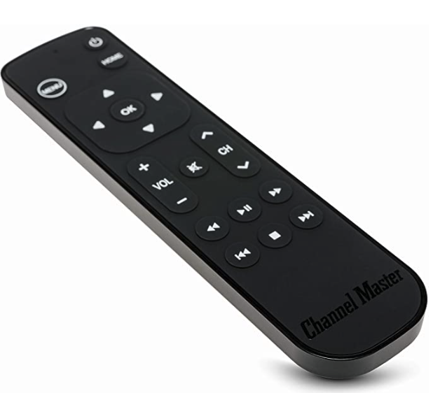
The first remote I tried to replace my Apple TV remote was the Channelmaster CM7000-XRC remote, which I was attracted to because it has honest-to-goodness arrow keys instead of a touchpad. My kingdom for an arrow key!
Unfortunately, this remote did not work with Zwift, and had trouble with other apps on my Apple TV as well. Basically, any interface that didn’t have items lined up in a very neat grid (like the Home Screen) was just too hard to navigate with the Channelmaster.
The Real Problem
Now that the Apple TV remote isn’t a complete design disaster, there is only one thing between Zwifters and being able to actually navigate the Zwift menus, and that is the Zwift menu interface itself.
The problem with the interface is that the UI elements are often stacked one on top of another, and there is no clear way to signal that you (the user) want to interact with an element or go to the next one. For example, there are many scrollable elements (selecting a route, a pace partner, a workout) on the menu screen, and although you can scroll up and down through the list, there are also UI elements below (and often above) the list. It becomes frustratingly difficult to navigate the list without accidentally navigating to those other items. With the new remote, you can “click” the outside wheel to navigate, but in Zwift doing so always selects the next UI element, not the next item inside the UI element you are working in. If Zwift could organize the elements so that they are in a grid (which is how Apple’s own on-screen interfaces all work), working within their menus would be infinitely easier.
It is extremely difficult to scroll down this menu. Clicking the bottom of the scroll wheel doesn’t pick the next item in the list, rather it jumps down to the “Cancel” or “Next” buttons.
Siri Remote for Zwift?
I was very enthusiastic to see that Apple had redesigned the remote for the new Apple TV, and put in my Father’s Day request right away (Happy Father’s Day to you all, BTW). I’ve just tried out and here’s what I found.
[sad trombone sound effect]
Unfortunately, the “click wheel” arrow buttons on the Siri Remote do not allow me to scroll through menus in Zwift, which was the one thing I was desperately hoping for. You can scroll up and down using the wheel (basically, the edges of this new, round trackpad), but there’s no way to go “up one” or “down one”, which is what we really need. I haven’t tried it out while actually Zwifting yet, so I can’t say if it works better than the old remote, but I can tell you that it doesn’t do the thing I really was hoping it would do.
As a small consolation prize, it does seem like a much better thought-out device. It has a better shape, you can tell the top from the bottom without really examining it too closely (unlike the old remote, which gave you a 50-50 chance of picking it up with the touchpad on top), and seems better in nearly every way. I should also say that there isn’t anything about this new remote that seems to get in the way of Zwifting, so if you go this route at least you don’t have to have one remote for Zwift and another for all the rest.
It’s up to you, now, Zwift
OK, Zwift, the ball is in your court. Apple just redesigned their remote, and it’ll probably be years before they do it again. You are our best bet now. Please find some way to allow us to pick routes, change bikes, etc, without the agony of the touchpad! How about a closet in the Zwift garage where I can put all those bikes that I’m never going to ride (who needs more than three or four bikes in this game?), right next to the fifty jerseys I’m never going to wear?
It’s a great game, and it’s been great watching it evolve over the last couple of years, but that doesn’t mean it hasn’t been frustrating, too.
Before I begin discussing the Strive Score, let me note that I’m not a doctor or any other type of accredited authority. I’m just an ordinary Pelotoner who likes data. This blog should not be used in place of advice from a real medical expert.
On April 30th, 2021, Peloton announced a new heart rate-related metric across all workouts. They call it “Strive Score” and here’s how they describe it:
Strive Score is a personal, non-competitive metric that measures your performance in every workout—from equipment to the floor. All you need is a compatible heart rate monitor…and some good old-fashioned motivation.
Peloton PR
The Holy Grail, not just for Peloton but for all on-and-offline fitness programs is finding some way to quantify effort in a way that is meaningful regardless of your personal physiology and fitness level. This sort of universal measurement has so far eluded sports science, and is a huge barrier in the automation of any sort of personalized training program. Some day, when science has evolved sufficiently, we will look back at the sort of metrics we use today as being very crude, but nevertheless today this is what we have to work with.
Peloton’s best metric in this regard is the good ol’ FTP number. FTP, Functional Threshold Power, is a number which is arrived at by actual experimentation on the athlete. Basically, to find your FTP score, you work as hard as you possibly can for a period of time, and however much work you can do (a multiplier might be involved depending on how long your test is) becomes your FTP. Your workout intensity is then based on that number (10 minutes at 80% FTP, 5 minutes at 110% of FTP, etc). Periodically, you re-test to recalibrate, and use the new FTP number as the basis of future workouts.
The Strive Score explained
Many people do not want to endure the FTP test, and that’s understandable. Unfortunately, if you’re not going to be using a benchmark that was at least arrived at using real-world data about you individually, you really have no choice but to fall back to something that is far more generic. This is where heart rate comes into the picture. Heart rate correlates to effort, of course. Your heart rate is slowest during most phases of sleep, and is highest when doing strenuous work such as running or climbing stairs. We’re all individuals when it comes to how quickly our heart rate increases under stress and how quickly it recovers when resting, but it’s generally safe to say that you’re generally working harder when your heart rate is higher, and working less hard when it is lower.
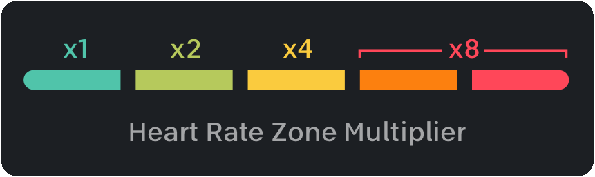
The Strive Score seeks to quantify heart rate over time. Even sitting still you’ll generate a strive score value over time (at a rate of about 0.0048 points per second), as long as your heart is beating. The longer you go, the higher the score rises (so a ten minute effort at constant heart rate will yield double the score of a five minute effort at the same heart rate). Raising your heart rate above a certain percentage of your maximum heart rate* triggers a bonus multiplier (starting at 2x for heart rates above 65% of maximum).
Peloton’s heart rate zones. Zone 1: < 65% max, Zone 2: 65%-75%, Zone 3: 75%-85%, Zone 4: 85%-95%, and Zone 5: > 95% maximum
Since the heart rate multiplier and time are the only variables, it is fairly easy to calculate the theoretical minimums and maximums of the Strive Score, and they are as follows**:
Minutes
Minimum
Maximum
5
1.4
11.6
10
2.9
23.2
15
4.3
34.8
20
5.8
46.4
30
8.7
69.6
45
13
104.4
60
17.4
139.2
90
26.1
208.8
Note that the strive score is incremented every second, so you will not be able to hit the max score for an interval unless your heart rate is the maximum zone going into it.
Reading the table: The table above lists the minimum and maximum attainable values for the indicated duration. For example, if your heart is beating, you cannot get less than a 1.4 score in five minutes of exercise, because you will be in zone 1 the entire time. If your heart rate is in zone 4 or above for the entire five minutes, your five-minute maximum would be 11.6 points. If you effort is not strictly zone 1 or zone 4+, your strive score will be somewhere between these minimums and maximums, depending on how many seconds you spend in each zone.
Strive Score or FTP, which is best?
I think I can say without fear of contradiction that the FTP test result, if arrived at after a valid test, is the best available metric of fitness available to us. It’s what I use to track my own fitness, and I rely on it more than I do heart rate or Strive Score.
Another nice thing about FTP is that it is not a Peloton concept, but rather it is used in other areas of sport. Zwift has a very nice feature to calculate FTP, for example.
All that said in favor of the FTP, the Strive Score has one very intriguing feature that FTP lacks, and that it is intended to be an indicator of effort rather than an indicator of achievement. As your fitness improves, it actually becomes easier and easier to hit your FTP numbers (which is why you need to re-test and re-calibrate periodically), because FTP is a measure of achievement, and when you’re fitter you can achieve more (or, in this case, achieve the same with less effort). Strive Score, as a measure of effort, should be less affected by your relative fitness (though it is, to some extent). For people seeking to improve their fitness, and who are looking to get some sort of feedback that they’re putting in the right amount of effort (at least, as compared to other attempts), the Strive Score could be a useful metric for that sort of information.
** The per-second strive point value of 0.00483 was arrived at through experimentation. Please let me know if you get markedly different results, and I will try to refine this value. I confess that I expected to find it to be a “rounder” number, such as 0.005, but it doesn’t actually seem to be quite that high.
If a dog spends over a year at a shelter, watching patiently as the dogs around her come in and out every few weeks, you can be pretty sure the dog has some medical or behavioral challenge that makes it necessary for the shelter take extra time to find the “just-right” adoptive family.
Or maybe it’s just because she’s a pit bull.
Shelter life is a challenge for any dog– for reasons that are probably not hard to imagine– but pit bulls have it even harder. There’s one particular dog that brings the whole issue into focus for me, and that’s a dog named Bijou.
Bijou arrived in late 2018 from another shelter. She quickly gained fans among the volunteers for her cheerfulness and her enthusiasm for play. She was healthy, and at about five years old wasn’t so old that potential adopters shied away. She made friends easily. We had a lot of fun afternoons running around in the field, and this dog loved a Kong like no dog I’ve ever met. As for her adoptability, though, Bijou had two strikes against her. One is that, frankly, she’s not really into dogs.
Some dogs just don’t like other dogs. They like hanging out with their people, and don’t really have much use for dog-friends. The reason why this is such a big deal for a dog like Bijou is that often in the shelter, when we have a long-time resident as well-liked as Bijou, eventually one of the volunteers adopts her. But the catch is that most volunteers, if their circumstances allow it, already have one or more dogs at home! Many of Bijou’s fans, myself included, just couldn’t take this dog home with them.
The other reason that Bijou remained at the shelter, month after month, is that she is a pit bull, and life isn’t easy if you’re a pit bull. Many people fear you, and even if they don’t, they have to deal with friends, relatives and/or landlords who do. About ten months into Bijou’s stay in the rescue, I had the chance to show her to a great family that was looking for a playful dog. They all got along great during the “meet” and it looked like she had finally found her “furever” home. Later, though, there was bad news… the family told me that they were avid campers, and they learned that a pitbull would not be welcome in a lot of the places they go.
Back to the kennel she went.
Pit Bull: America’s Dog
It wasn’t always that way. For most of the breed’s history, pitbulls (which is actually a collection of several breeds: the American Pit Bull Terrier, the American Staffordshire Terrier, Staffordshire Bull Terrier, and a few others) were neither shunned nor feared the way the are today. Indeed, it would be easy to make the argument that the pitbull is “America’s Dog”. In the 1920s and 30’s, one of the most famous dogs in the country, Petey, was a pitbull (actually, two), as was Buster Brown’s trusty sidekick. Pitbulls weren’t fancy, but Americans tend to reject anything that seems too fancy, anyway.
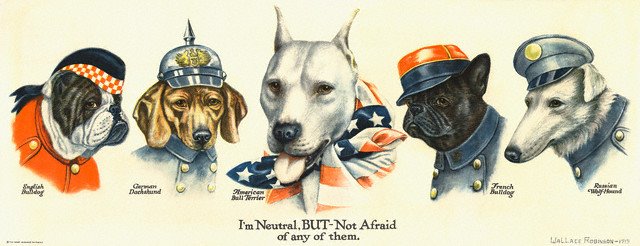
To illustrate the pit bull’s place in the American pantheon, you can see how often it appeared as a symbol of America during the world wars. While Germany was often portrayed by the dachshund and England the bulldog, no dog better suited America than the pit bull: no ifs, ands, or buts about it. (As a historical footnote, dachshunds were treated horribly by Americans during the wars, with the little dogs sometimes being beaten or poisoned by those who felt the little twenty-pound dogs posed a clear and present danger to the nation. At the same time, the German Shepherd Dog was renamed –temporarily– “Alsatians“, or just plain “Shepherd Dogs”.)
Wallace Robinson produced several propaganda artworks featuring the pitbull representing America.
Theodore Roosevelt had a pitbull, named “Pete” in the White House, but I won’t go into that particular case because Pete wasn’t exactly the model of good behavior. All I can really say is that, like people, all dogs are individuals and just as there isn’t anything about a pitbull that makes them somehow worse than other dogs, there also isn’t anything about a pitbull that makes them somehow better. So, let’s carry on.
Not the original “bad dog”
For a generation now, pit bulls have carried the stigma of aggressive, dangerous dogs, so it’s hard to imagine that fifty years ago, they were safely outside of society’s crosshairs.
In fact, the first widespread breed-loathing in this country occurred in the late 19th century, and involved “spitz-type” dogs, a group that includes Huskies and Pomeranians, and stems from some dubious scientific claim that they were particularly susceptible to (carrying) rabies. This panic resulted in the widespread destruction of spitz-type dogs and breed-specific legislation, many of the same things we see today in regards to the pit bull.
Pit bulls didn’t begin to get their bad reputation until the 1970’s. Beginning in that decade, the American people became increasingly fearful of violent crime. Whether the country did actually become more dangerous during this time or whether this was just a mass hysteria (or a combination of the two) no longer matters; Americans were convinced that violent crime was on the rise, and they were afraid. Fearful Americans sought dogs to accompany them for protection.
For the well-to-do, the German Shepherd Dog was the protection dog of choice. (Notably, German Shepherd Dog bites outnumber pit bull bites in most tallies, but it is widely recognized that bite data is woefully poor as a whole and shouldn’t be relied upon.) The less-moneyed gravitated toward pit bulls which were smaller than GSDs, less costly to keep up, and easier to keep on a smaller property or an apartment. It goes without saying that in America, the less-moneyed classes also tend to be the minorities.
Once the pit bull became associated with the poor and minorities, it became easy to use discrimination against the dogs as a convenient proxy for discrimination against their people. It may be illegal (and, in most circles, socially unacceptable) to refuse to rent an apartment to certain colors of people, but society considers it perfectly OK to refuse to rent an apartment to an owner of a pit bull, which statistically speaking is more likely to be a minority or member of the lower classes.
Embracing the stereotype
At this point, we begin to enter a cycle, when popular culture begins to embrace the bad-boy characterization of pit bulls. Some people took on pit bulls as pets precisely because they were considered dangerous, and encouraged their dogs to be aggressive. The pit bull became the dogfighting icon, and even though it has been a long time since there have been a substantial number of fighting dogs in this country, the perception has been cemented. Google the phrase “pit bull logo” and witness the preponderance of spiked collars and snarls. Increasingly, dog bite stories in the news tended to identify the biting dog as a pit bull despite very sketchy background information (“witnesses may be predisposed to assume that a vicious dog is [a pit bull]”).
The first rows of a Google image search for “Pitbull Logo” shows clearly how we think of them.
Breed-specific legislation — with no foundation in reliable data — targeted pit bulls in a number of American cities, and are only recently being rolled back as we, as a nation, begin to realize the flimsy rationale and bad data behind them. In 2020 the people of Denver to vote to lift a pit bull ban that costs the lives of thousands of dogs — dogs that had no history of aggressive behavior. The ban had been in place for thirty years.
Although America is far from being able to free itself from widespread racism, there are very few places in this country one can openly embrace racism without becoming a social pariah. Not so with prejudice against pit bulls. People who pride themselves on their commitment to racial harmony and fairness in this country have no problem singling out one breed of dog (often based solely on appearance) and declaring them to be worthy of death. And America is not alone. Just last week in the UK, a dog who, in the words of the judge overseeing the case, has an “excellent temperament” and was not known “ever to have shown aggressive or dangerous behaviour”, will be put down because he is a pit bull-type dog, one of the breeds specifically impermissible under Britain’s Dangerous Dog Act.
The legacy
Even in the “woke” 2020’s, the discrimination we show against pit bulls is appalling. Pit bulls spend years in shelters hoping to be adopted, either because people fear them or do not want to take on the societal baggage associated with owning a pit bull.
Thankfully, there are still people out there whose minds are a bit more open. Around Christmas time last year, a family — parents with two small children — came to the shelter to visit with the dogs. They had recently lost their family pet, they said, and although they were not looking to adopt another just yet, they thought the kids would enjoy giving treats to some of the shelter dogs and brightening their day.
As it turns out, the most popular pages on this site are some posts I created a year or two back regarding the Peloton screen and what all the numbers on it mean. I thought it might be of interest to people if I created the same for Zwift, because there are many more overlays on the Zwift display, and they are also contextual — that is, they change depending on what you are doing in the game at the time.
Because this topic is so vast, I am going to have to build my post(s) out in stages, starting with the most common overlays and working my way toward the less common variations, including workout and racing. I’m committed to doing an update each week, but it may, in fact, be several weeks before I’m able to capture it all. Ever since I had the idea to document it all I’ve been mindful of how much data is actually on the screen and how often it changes, and the job gets bigger every time I look at it!
The top-center display: the basics
I might as well get into it, though, so here goes!
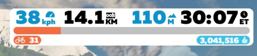
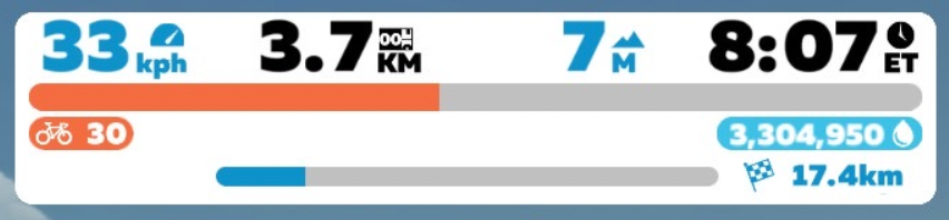
This is the display that is top-center of the screen, in its most basic form. If you are doing a workout or in a race you may see additional data (I’ll document later), but if you’re just riding around then this is your basic display, and contains all of the most basic information about you and your ride. The data shown above is always present in every mode of the game.
The blue number on the left (38kph in this case) is your speed. Whether it’s displayed in mph or kph depends on whether you’ve selected “imperial” or “metric” units in the preferences. (It is well known that Zwift points accumulate approximately 7% faster under the metric scheme, so that’s what most people use, even in the USA).
The black number in the center (14.1km) is the odometer, the total distance of the ride up to that point. It starts at zero and counts up as you ride.
The blue number to the right of the odometer (which reads 110m in the image above) is the amount of vertical climb traveled so far in the ride. This is displayed either in feet or in meters, depending on your choice in preferences.
The far right, black number in the white box (30:07) is the elapsed time of the ride. It is labeled “ET” for elapsed time.
Below this top row of numbers is an orange progress bar. This gives you a graphical representation of how far you have to go to get to the next level in Zwift. Generally (but not always) the distance between each level in Zwift is greater than the distance for the previous level, so one tends to advance more quickly early on and progressively more points are needed to advance as you progress through the levels.
Just below and left-justified with the orange progress bar is a bike icon and your current level (31 in this example). The blue number that is below and right justified with the orange progress bar is the number of “drops” you have accumulated. In this example, 3,041,516 drops are shown.
Briefly, drops are a sort of currency in Zwift, and you can spend them on new bike frames and wheels (other bike frames and wheels are awarded to you for certain accomplishments, such as completing the California, Italy, or Everest Challenges).
You can see to the right of the drops number a thumbs-up icon. That icon is only present for a few seconds after receiving a “ride-on” from another player. For those few seconds, you accrue drops at a slightly accelerated rate. There is also a mountain icon that you might see, which indicates that you are accruing drops faster due to riding on a relatively steep incline. And yes, you can be both riding an incline and receiving a ride-on at the same time. In that, case you will see the icons alternate for as long as they are in effect.
So, that’s the most basic display, and still it took several paragraphs! Let’s get into some of the contextual displays:
On a route
Here’s a display that is much like the basic Zwift display, but with some additional information at the bottom. You can see a progress bar and a checkered flag with a distance number (17.4km). This is how the main white box will look if you are riding a fixed-distance route, such as in a meet-up or event. The progress bar shows progress along the route (looks to be about 20% in this example) and the blue distance number is the distance remaining in the route. Since it’s the distance remaining, you’ll see it decrease as you ride. Ultimately, the blue bar will become completely filled in and the blue distance number will diminish to 0, and that will be the end of the fixed-distance route.
Basic display during timed segments
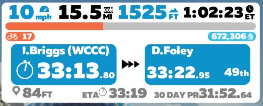
When you are approaching the end of a timed segment, the display changes to show more information about your performance during the timed segment. The top of the display is the same as usual, showing (l-r) speed (10mph), distance covered so far (15.5mi), height climbed so far (1525′), elapsed time (1 hour, 2 min, 23 seconds), a progress bar showing progress to the next level, the current level (17) and the current number of drops (672,306).
Next you’ll see two blue boxes. The left box is your own elapsed time through the timed segment (33:13.80 in this case). The right box is the time it took another rider to complete the segment. In the illustration, it shows me that D.Foley completed the segment in 33:22.95 and took 49th place for the segment. This tells me that I have approximately nine seconds to finish the segment to take 49th place from D.Foley. If I cannot complete the segment in less time than Foley, the right-hand blue box will show me the time of the 50th place finisher, and I can try to beat that. The right-hand box will cycle through all the finishers until I, myself, finish.
The bottom line on this display, from left to right, is the distance left to go in the segment (84 feet), an estimated time to complete the segment (33:19 – note that this is the estimated total time, not the estimated time remaining), and my own 30-day PR for the segment.
So, if everything went according to plan on this ride, I would have finished the segment six seconds after this screen shot was taken, finished in 49th place, and pushed D.Foley to the 50th spot. Of course, it ain’t over until it’s over, so you need to keep pushing until the finish line!
UPDATE: I had planned to make this a series of posts describing all of the overlays of the Zwift screen, but as I started gathering information about the next screen I was working on, I found that there already was a lot of good documentation available, on sites like ZwiftInsider and others for that reason, I think I will not continue to build out this set of posts. I might change my mind if Zwift adds new features without any good documentation, but for now I do not want to duplicate work that’s already been done.
I am uncharacteristically perturbed by the recent announcement by NASCAR that the “NextGen” car in development will do away with the familiar five bolt wheels in favor of a single lug nut. I tell you, take your eye of these guys for a minute and they think we’re in France, or something.
Here’s what happened…
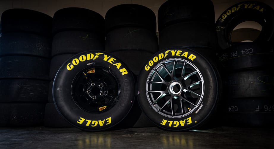
Good old American steel stock car wheel (left) and the hoity-toity aluminum wagon wheel with the spinner hub.
NASCAR is moving from the time-honored 15″ wheels to enormous 18″ ones, I guess because the ride of a NASCAR race car wasn’t harsh enough, they decided to shorten the sidewalls. It’s bad enough our road-going cars have 18, 19, 20-inch wagon wheels that make them jittery, bend in every pothole, and get scraped up on every curb. Now, NASCAR has to follow suit. Well, at least they’re doing something to emulate true stock cars, which they’ve really seem to have abandoned over the past decade or so.
That’s not all, though. This new 18″ wheel isn’t made out of good old steel –which I shouldn’t have to mention was plenty good enough for Richard Petty and Dale Earnhardt– but rather a fancy, exotic metal: aluminum. ALUMINUM! I’ll bet they pronounce it “al-yoo-MI-ni-um”, like the English. Aluminum wheels –like the people who design them, no doubt– react badly if the lug nuts aren’t all torqued down to the correct specification, so they’re prone to failure if the tire changer doesn’t fully tighten all of the lug nuts.
You got that right… you won’t have any problems unless the mechanic failed to make sure that the nuts were put on just right. On an American car. Why are we even worried about that? When was the last time an American car had a quality control problem?
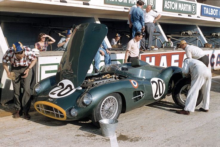
The solution to the problem, apparently, is to have one giant lug nut, just like on this car:
When you think of NASCAR, do you picture an Aston Martin with euro-style roundels and wire wheels? Maybe you should, ’cause it feels like that’s where we’re headed.
Come on now, guys! I’m fine with the six speed transmission you have planned. After all, I can’t remember the last non-vintage four speed I’ve seen. Ditto with the independent rear suspension. And I’m not going to grumble about your carbon fiber tub and moving the driver more to the center of the car because you pretty much have to do what you have to do for safety. But eliminating 75% of your lug nuts is just going too far. This isn’t Formula One or any of those fancy-pants European series. This is ‘Murica. Not only has the humble lug nut been THE fan souvenir for decades, but having them spat out and flung around, hither and yon, by the spinning wheels of cars racing out of their boxes always gave Pit Road a dynamic, war-zone feeling.
Save the lug nuts, NASCAR. It was bad enough when you got rid of the Catch Can Man. I can’t believe that was ten years ago already. Next thing you’re going to tell me is that you’re going to lose the whole gas can idea and run gas hoses out to the cars during pit stops, just like they do it over in Europe.
If you’re a Zwifter, chances are that you’re running (or wish you were running) the Wahoo Kickr smart trainer. The Kickr, which is now in its fifth generation, may not be the absolute best trainer out there, but it is the established leader in the space, and when you’re dealing with a system such as Zwift that has components from so many different manufacturers involved, there is safety in numbers.
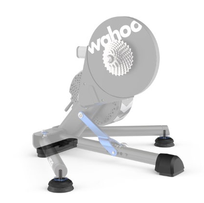
Photo from Wahoo showing the new parts (in black)
Competitors are always trying to find an edge, of course, and some of those competitors started to explore bikes that lean, something the Kickr does not do. Saris introduced the MP1 Nfinity Trainer platform, a $1200 boogie board for your bike, which I am going to try out as soon as $1200 doesn’t seem like a ton of money to me. (Attention Saris: I’m an influencer! Send me one of these!) Manufacturers like RealRyder and Bowflex have bikes that lean (though, notably, Wahoo’s own $3500 Kickr Bike doesn’t), and although those machines aren’t direct competitors to Wahoo’s Kickr, you have to imagine that all of these cycling products will converge over time and that market share matters.
I don’t have any insider information, but it certainly seems to me that Wahoo felt the need to respond to this trend, and their response comes in the form of AXIS Action Feet, a product whose very name seems like a desperate bid to generate excitement.
What are the Kickr AXIS Action Feet?
The biggest difference with the AXIS Action Feet are on the sides, where larger, thicker feet (shown attached to the Kickr replace the much smaller original feet.
The AXIS Action Feet are standard issue for the new Wahoo Kickr devices, and available as a retrofit for older models, at a not-insignificant price of about $80. Still, after one spends a couple grand on a bike and at least a thousand dollars for a Kickr setup, an additional eighty bucks might seem like a trivial amount to pay for an improvement in the experience. Still, eighty dollars is eighty dollars.
The AXIS Action Feet (I’ll just call them “Feet” with a capital “F” from now on) is a replacement set of feet for the Wahoo Kickr.
installing the Kickr AXIS Action Feet
Installation of the Feet is very simple, and can even be done without removing the bike from the trainer, if you’re lazy. Just push one of the Kickr arms back to the center and lay the whole assembly on its side. You might get a bit of grease on your fingers but it’s not a dirty job.
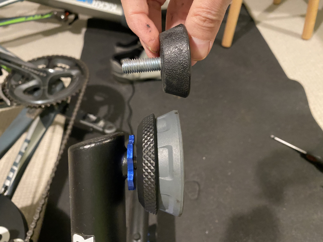
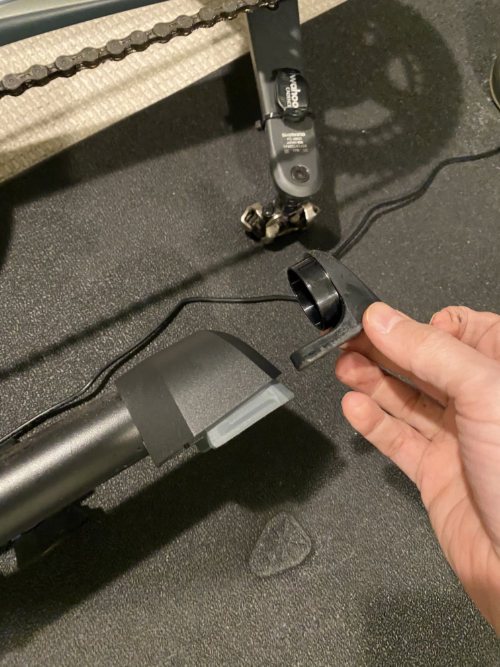
The front and back replacement feet require a Phillips screwdriver. The side Feet just screw in. The blue aluminum retainer is a stock piece and you can just swap them over to the new feet. Installation is a ten minute job, and there is very low risk of damaging anything or injuring yourself, as long as you’re careful.
The difference between Action Feet and the stock feet
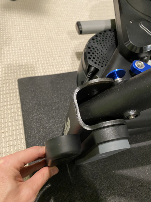
The front replacement foot (seen attached to the Kickr) is much beefier than the stock foot, but functionally isn’t really any different.
Two of the feet are along the centerline of the bike and are basically needed only because the other two feet, the ones that are attached to the arms, are taller requiring the centerline feet to be taller as well. So, the forward and aft centerline feet aren’t very remarkable, they’re just slightly beefier versions of the stock feet.
The only Feet in a position to make any difference (literally and figuratively) are the two Feet attached to the stabilizing arms of the Kickr. These replacement Feet are, as you can see from the photo above, considerably beefier than the ones they replace. They are also bigger in surface area, so they will perhaps help a bit in keeping your Kickr from sinking into the carpet or your mat. As with the stock feet, you can height-adjust the two “side Feet” to level the bike.
Do the Wahoo Kickr AXIS Action Feet make a difference?
Answer: No.
Oops. That’s far too short an answer considering I’m making a whole blog post out of this topic, so I’d better elaborate, and maybe provide some caveats.
I’ll start with the caveats. One is that I didn’t perceive a noticeable difference, and that doesn’t mean you won’t. Second, my bike is on top of a thin mat which itself is on top of a reasonably thick carpet. I think that if the bike were directly on a cement slab, then maybe I’d have a better chance of detecting a difference. As it is, I really don’t think I can tell the difference.
The rear foot (seen installed on the Kickr) is, like the front foot, pretty much just a spacer lift the trainer a bit to accommodate the thicker side feet.
The Action Feet ride experience
As I said, in my experience, the experience of riding with the Feet isn’t noticeably different from the experience of riding with the stock feet, but I don’t know if altering the feet of the Kickr ever really had a chance of success. The front of the bike is not anchored at all, of course, so when I am really mashing the pedals for a stiff uphill (which is where I think one would see the most side-to-side stress), the sensation of having the front of the bike relatively free and the back of the bike much more rigidly fixed is very unnatural. It’s not as though Wahoo could have made this product much better and didn’t, this type of trainer architecture just seems to have this limitation that the back end of the bike is sort of anchored to the floor while the front is free to move, and I don’t see how one can really get around that.
Unless you have the Saris trainer platform, maybe. That thing seems prohibitively expensive to me, but it’s very existence suggests that the engineers over at Saris recognize this problem with the trainer architecture and are betting company R&D money that the best way to fix it is to put the entire assembly on top of a movable platform.
The Saris training platform retails for $1,200. If you save money by not buying the Kickr AXIS Action Feet, then that cost is a mere $1,120, which still feels a lot like twelve hundred dollars.
Well, after reading more about the psychology of free-to-play games, I’ve finally given up Sim City BuildIt once and for all (… but probably not for long). (For the record, SCB wasn’t by any means the worst offender in the free-to-play world, but it’s an enormous time-suck nonetheless). However, after being subjected to maybe a hundred online ads (sitting through online ads is a shortcut to certain goals in the game), there’s one image that still stuck in my mind:
This is a scene from the ad for a game called “Age of Z” (or, at least I think that’s the one). From what I’ve seen in the ads, I can tell you that this game involves killing many zombies and building your home territory (which, I believe starts as a reclaimed junkyard) into a thriving city.
This image, which appears near the end of the ad and seems to show a pretty well-established city bordered by a tall wall topped with machine gunners who fire non-stop into approaching waves of zombies, always (at least for the few seconds the scene appears) killing enough to keep the leading edge of the wave at bay.
(Aside: it’s curious that the wave of zombies is squared off the way the city is. You’d think that the shape of the zombie wave would be dictated by the firing arc of the machine guns, in which case it would have the shape of a square with rounded corners. But I digress…)
Welcome to America, circa 2020
Maybe I’m reading too much into this, but this scene strikes me as a metaphor for the way many Americans view their world? Inside the walls, it’s a pretty nice place. Let me call your attention to a few details:
The buildings inside the compound have strikingly appealing architecture. They have landscaping, paved roads, sidewalks. This particular building seems to have advertising and a neon sign. At the moment, no one seems to be on the streets because they are all on the wall shooting zombies, but presumably at some point at least some of them can climb down and enjoy maybe a movie or an art show or something.
Outside, though, there are waves and waves of zombies, coming to… well, I don’t really know. Eat everyone’s brains? I’m not really a zombie expert, but I think it’s safe to say that the zombies pose a threat to the resident‘s lives, or at least their way of life. They are storming the walls, and it certainly seemed to imply that if they were ever to make it through, well, that would be the end of civilization.
Frankly, that’s how I think a lot of people see America today. Remember that couple in St. Louis who pulled guns (including a machine gun, if you can believe it*) on Black Lives Matter protesters who walked down their private road en route to a demonstration? What a scene! Rich people standing in their beautifully manicured lawns, staring down the barrels of their guns at outsiders who had literally come through the gates. I can’t help but wonder if, after the protesters dispersed and the guns were back in the locker, those two defenders of liberty and freedom went back to playing their game of Age of Z.
From another game in the series. The homeowners are enjoying a cookout in their front yard while the automated defense system slaughters the zombies beyond the fence.
OK, I think I’ll stop now. I’m not really trying to get political with this blog, but I do wonder if I’m the only one who looks at this game and sees the “defending our way of life” fantasy fairly obviously embedded in it. If many video games are a form of wish-fulfillment, what does it say when our wish is to live in a nice place we can call our own and open fire on anyone who tries to get in? Castle Doctrine as escapist entertainment.
In any case, it’s not a game for me. I’d rather be flinging birds at green pigs and their absurdly poorly built homes. Though I have to confess that I do wonder at what point the birds and pigs really should just sit down and talk. Where does it end?
* And of course you can believe it, which is pretty awful in and of itself.
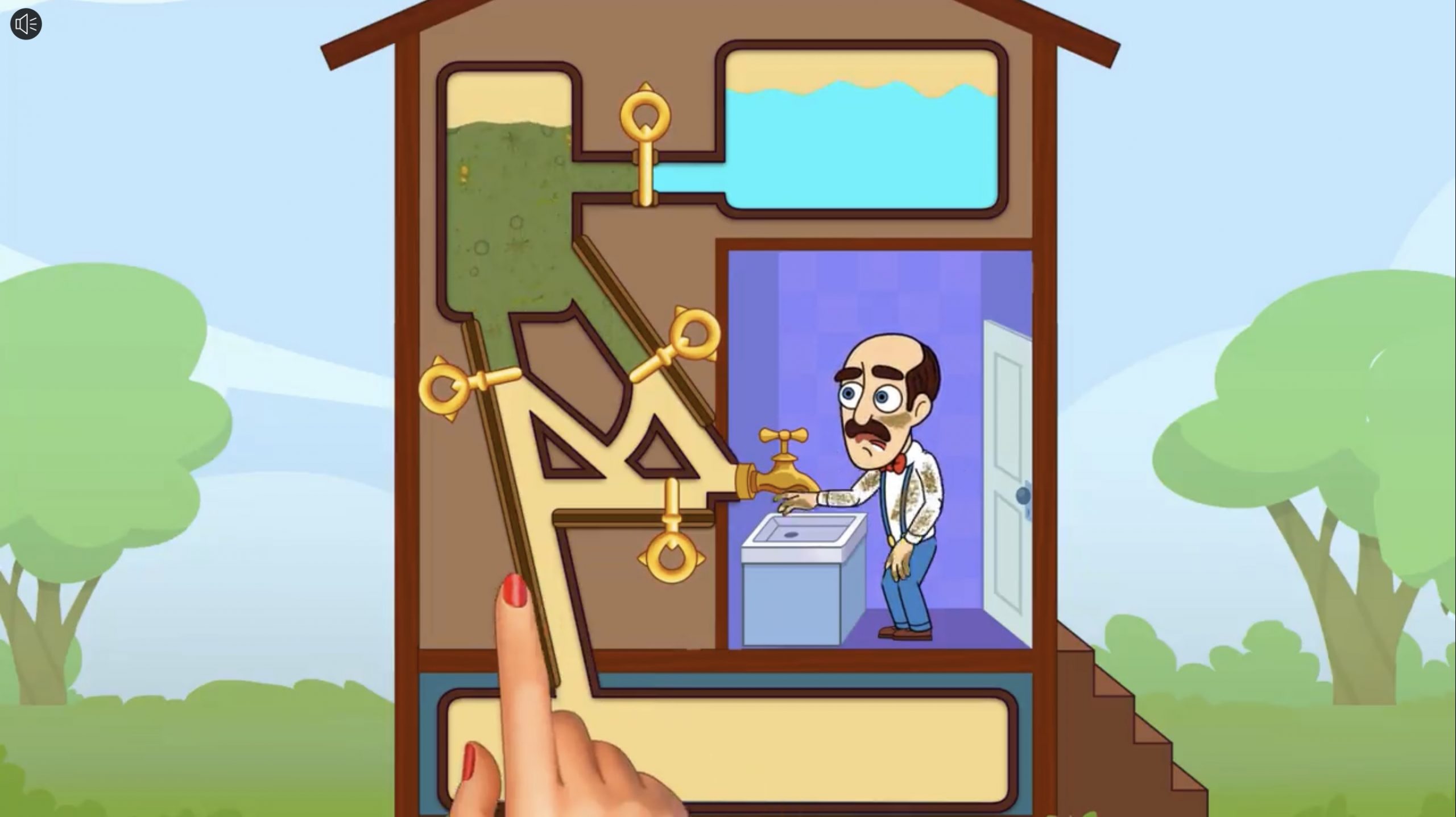
There is a game called Homescapes whose ads subject you to an endless loop of an animated hand attempting —and failing— over and over, to solve a simple logic problem.
There are tons of games like this out there, each of which asks you to manipulate a series of gates so that your nemo-fish escapes a shark, your adventurer gets the gold, your sheep escape the terminator-like advance of a combine harvester, or whatever. It doesn’t really matter. There are gates, there’s something you want and something you don’t want, and your job is to manipulate the gates to avoid disaster.
Another thing that these games all have in common is an animated demonstration of how to manipulate the controls. And they invariably show you how to do it wrong. The wrong switch gets tripped and the lava falls on the fish, or the toxic sludge drenches the homeowner or whatever. It is, frankly, infuriating to watch. Over and over again, the disembodied hand moves the lever that obviously spells doom for the sheep/fish/damsel, and you find yourself thinking, “Move! Let me do it.” It’s almost if it’s by design.
I haven’t actually played any of these games, mostly because it would feel like giving in. So, I say “sorry, little fish, good luck with that lava.” I just can’t afford to get involved with what is clearly someone else’s problem.
I do have questions…
Speaking of other people’s problems, the winner in that category has to be the poor guy who lives in the game “Homescapes”. That’s him in the picture above. The disembodied hand is clearly tasked with getting the fresh (blue) water into the sink and avoiding the disgusting, toxic water. What I want to know is, how did this house get a certificate of occupancy in the first place? How can it be to code to have the fresh water and the toxic water flowing through the same pipes? Clearly, even if the disembodied hand can figure out how to drain the toxic water from the system (it can’t, by the way) the fresh water has to run through the same pipes. I certainly wouldn’t be washing up with that water after knowing where it’s been!
And how did that toxic water get there in the first place? Was there an architect who sat down at his blueprints and said, “we’ll keep the toxic water up here, and attach it to the sink and the fresh water. That’ll save us some copper!”
The whole setup reminds me of the Schitt’s Creek episode “The Drip”, in which Johnny Rose is awakened by having “brown sewage water” dripping from the ceiling into his bed. What struck me as odd is that the Rosebud Motel is only one story. If the water was indeed sewage water (which seems to be implied, though it’s only Johnny’s conjecture), why would it be above them? That would mean that somewhere in the Rosebud there’s a pump that sends sewage up, not common except in basements and other subterranean areas. (Anyway, the show gets a pass because it’s hysterically funny, but some people notice things like that.)
Only 5% Can Solve This
As if watching someone fail over and over to solve a very simple logic problem isn’t enough, the ads want to make sure that you’re well and truly on the hook. So it ends with this phrase: “Only 5% can solve this”. Now the gauntlet has really been thrown down. Now I’m thinking, “Really? Only 5% (of people, I’m guessing) know not to drop the gas can on top of the kitchen fire? I must be some kind of genius, because that occurred to me right away!” Somewhere out there, no question about it, there’s someone who downloads this game just to prove to the world (as if the world is watching and this isn’t just the spotlight effect) that they’re in that elite 5% of thinkers. Me, I’m too smart for that. Besides, I’m too busy playing Sim City BuildIt.
Sim City BuildIt: The Tar Baby for Completionists
You may wonder where I’m seeing all these ads for mobile games. Why, I see them when I’m playing a mobile game, of course! The one that I have sadly fallen victim to is Sim City BuildIt which is, as far as I can tell, the modern incarnation of the much-loved Sim City.
It’s sort of “Sim City Lite”, though. There is much less strategy as far as I can tell. Because you can move things around easily and you get refunds on things that you’ve built but now want to bulldoze, you don’t really need to think ahead. Also, there seem to be many fewer options you have to influence the outcome of your city. Basically, you build stuff, and the stuff you build generates money so that you can buy the stuff you can’t build. It’s actually really basic, but it’s a total trap for completionists like myself.
See, I’m almost ready to send the cargo ship at my port off to some far off land. I just need to load one more shipment of cabinets onto it. Of course, to make a cabinet, I need lumber, so I have to load up my furniture factory with lumber. Where does the lumber come from? From wood, of course. I need to make sure that the building supply store has enough wood (which, in turn, comes from a factory). Each of these stops has a finite number of items that can be put in the queues, and production times that range from minutes to hours. It’s an endless list of cascading dependencies, and the more you accomplish, the more complex the items you need to make become (oh, the days in the beginning when you could just dump a bunch of raw metal onto a building site and get a house!). You can, of course, pay real actual money to speed up the process (and it’s that feature that makes the game “free to play” because it subsidizes all of the development costs), but that feels like cheating. No, I’d rather pay in time, lost minutes and hours waiting for that hunk of cheese to be finished at the farmer’s market so I can get it over to the fast food place to make cheese fries. Seriously, though, it’s enough that I’m giving over so much time to a game, but I still can avoid becoming a whale for free-to-play apps.
Easy to quit, I’ve done it many times!
This morning I deleted the Sim City app from my iPad. Of course, I’ve done that a few times before so it’s hard to know if this is really it or not. At this point, though, I’ve spent enough time in the game that it has gotten almost insufferably repetitive, and each time I quit I feel a bit less pull to go back. Of course, the city itself (”Buddyton”, if you were curious) lives in the cloud, so all I have to do is download the game again and run through the tutorial before I’m back to tending to my residents complaining that I really need to build that solar farm because the coal plant is killing them.
So, for now, I’m done with that stupid game. Will I ever go back? I might, but if I do I probably won’t say, because all that would do is confirm that I actually am as easy to manipulate as they think I am.
(Incidentally, I’m not including links to any of the games I mention here. You just don’t need them. You’re welcome.)
(PS: Apologies to anyone who are offended by the use of the phrase “tar baby”, which in recent years has been regarded by some as a derogatory reference to Africans (or Maori, Wikipedia tells me). Hopefully from context you can see that mine is not a racial commentary of any kind. Frankly, I was hesitant to even use this idiom, but I don’t know another that captures the meaning, and writing “a problem that is exacerbated by attempts to struggle with it, or by extension to a situation in which mere contact can lead to becoming inextricably involved” is a little wordy.)