Why I wear a Lumos Helmet

This is an objective, non-compensated review of the Lumos Helmet, which was purchased at retail. I have no connection to Lumos.

Santa gave me a Lumos Helmet for Christmas last year. My last helmet, a Giro Atmos II, made the ultimate sacrifice in a high-speed crash last October. I was so impressed with that helmet and how well it protected both my skull and my brain, I went right out and bought another, but Santa thought I could do better.

Strapping on my Lumos helmet

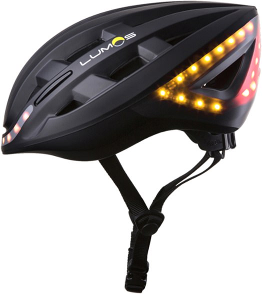
The main feature (you can call it a gimmick if you want) of the Lumos helmet are the built-in lights, and there are a bunch of them. There are white LEDs in the front which will help you stand out in a dark space, such as under shade trees or in a tunnel. In back, there’s a triangle of red LEDs that do the same job. They’re no substitute for a headlight and rear tail light, but a little extra lighting can’t be a bad thing. I think there’s enough data out there to show that lighting beats reflectivity or bright colors for safety.

The real differentiator of this helmet are yellow turn signals, front and rear, activated by either a set of buttons strapped to the handlebars (boring), or activated by your hand signals, facilitated by your Apple Watch (nerdy-cool). Since you can’t actually see these lights when you’re wearing the helmet, it beeps to tell you whether the turn signals are switching on or off, and the beeps for left and right are different, although you should hopefully know which one you’ve triggered.

Apple Watch / Lumos helmet integration

In practice, the Apple Watch integration works fairly well, but not so well that you aren’t going to get a few wrong signals on each ride. You need to calibrate your Watch, using the same gestures that you’d use while riding (that is, arm straight out for a left turn, held up for a right turn). To turn off the turn signal, you shake your wrist. Running over broken pavement can also trigger the wrist-shake gesture and turn off the turn signal, whether you want to or not. I haven’t check this with Lumos, but I believe that the turn signal turns itself off after some number of seconds, so if you had a feel for that you could learn to signal at the right moment and it would time-out when you wanted to. I haven’t used it enough to get that sort of thing down.

Calibration is a little tricky, and it’s possible I really haven’t done it quite right. You need to be in the same position you will be when riding — if you sit up in the saddle you’re not going to get the same effect. Essentially, you need to be riding while you calibrate (or have someone hold your bike while you get into riding position), which is tricky. Lumos has some suggestions about how to gesture for a turn that works best with the software.

Needless to say, you have to wear your watch on your left wrist for all of this to work. It so happens that I broke my left wrist in the same crash in which I broke my last helmet, so I usually wear my Watch on my right now. I have to remember to switch the Watch to my left if I want to use it with the helmet, which isn’t so convenient (switching wrists with the Apple Watch involved changing a setting on your iPhone). Not much Lumos can do about this, but it’s something to think about if you happen to wear your Apple Watch on your right wrist.

Let me talk pros and cons before I tell you how I feel about the helmet overall…
PROS of the Lumos Helmet

Lighting: The lighting adds just a little bit of visibility, which can’t be a bad thing. In my humble opinion, the helmet is good looking and I don’t feel silly with a bunch of lights on my head. The designers did a good job. I think the turn signals do a very good job of alerting riders and traffic behind you (if maybe just for the novelty of it) but since you have to make the hand gesture anyway, are there really circumstances in which you’re really communicating new information via the helmet lights?

Comfort: SPOILER ALERT — this is probably the #1 reason why I’m still wearing this helmet. It’s actually really comfortable to wear. I read a review of the helmet online in which the reviewer said the helmet was heavy compared to others, and that sounds reasonable given the additional battery and lights that it has. In practice, though, I can’t tell the difference. I haven’t weighed the helmets, but subjectively it feels no heavier.

CONS of the Lumos Helmet

False signals: As I said before, it’s really nifty that with a properly calibrated Apple Watch you can trigger the helmet turn signals just by using the ordinary hand signals, but it’s not perfect. Usually the gesture needs to be just so, and it doesn’t work every time. I’ve even had the helmet signal the wrong turn, not to mention all the times that vibrations from the road canceled a turn prematurely. It’s good, but it’s far from perfect.

Battery life: After about 3½ hours, the batteries in my helmet die, and at that point it’s just a helmet.

Cost: As of this writing, a Lumos helmet costs about $180, which is somewhat steep for a helmet. One crash, and I suppose you need to pony up another $180 for a replacement. Lumos should have a trade-in program that would let you send in your damaged helmet and get the electronics transferred to a new shell. You’d think that would cut the price for replacement somewhat, and it’d help with customer loyalty, too.

Would I buy it again?

In summary, let me try to answer the big question: if I didn’t have one of these helmets, would I spend the money to buy one? I don’t know if I would. After all, I was completely happy with my Giro helmet which was far cheaper, and I’m not convinced that the additional lights are that big of a safety feature. Still, the Lumos helmet is pretty comfortable, and I was just out on their website and saw the new models which look pretty slick. If they’re improving the software as they refine the design of the helmet as a whole, I’d definitely at least give it a look.

One open question

There is a beta feature of the helmet that I’m getting ready to try out, a brake light. As I understand it, the helmet (or maybe it’s your watch) detects your deceleration and makes an appropriate signal. When I got my helmet, the existence of this feature was practically an Easter egg, and wherever I could find reference to it Lumos was emphatic about this being a beta feature. Because of this, I haven’t tried it out, but I really should. If the helmet can detect and signal that I’m slowing, that would be useful. Not everyone (particularly non-bicyclists) recognize the “slow” hand signal, and this would be a novel feature. If I can make a determination of its effectiveness one way or the other, I’ll update this post.
Peloton Leaderboard – Numbers and Position

The Peloton leaderboard contains a great deal of information on how you’re performing, both against others who are taking / have taken your class as well as how you’ve performed in the past. It’s a fairly data-packed screen, so let’s get into it…

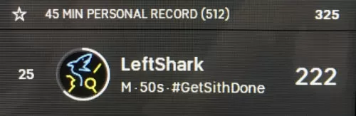
Exhibit A (above) is my own line item on the leaderboard, taken from a point in which I’m about 2/3rds through an on-demand ride. Let me start with the numbers (and other data you see here) before I go onto the leaderboard as a whole.

Personal Record Information

The very top line (that begins with a star) shows me my best effort for the length of class I’m taking. From this, you can tell that the screen shot is from a 45 minute class. The top bar shows my personal record for a 45-minute class (which is 512 kj). On the far right of the bar, you see the number 325. That number is a pacing number. It shows me what my pace was for the ride in which I got my PR. At this point in time in this ride (not the PR ride), I had made only 222 kj (see below for how I know that), so I know that I’m behind the pace for a PR (actually, WAY behind :).

If I am ahead of the pace for a PR, I’ll know it because this whole PR bar will appear below my status, instead of above it. This is handy, because you can tell at a glance if you are headed for a PR or not. Note that you have to have taken at least one class of the same length before you will see the PR bar.

Where I am in the Group

Next, let’s get into the status bar. The first number you see on the left (25) is my position on the ride. This may be my position overall, or it might just be my position within the filtered group (not enough information shown to know). Sometimes you’ll see your position number with another number below it in parentheses, and the number in parentheses indicates the unfiltered position. More on that later.

Moving to the right, you see my avatar. Surrounding my avatar is a partially complete white circle, going from the 12:00 position clockwise to about the 8:00 position or so. This is a visual representation of how far along in the class I am. When he clock is half full (that is, reaches the 6:00 position), I’m halfway through the ride. Note that this clock display of time is only available on on-demand rides — if you’re riding in a live class you will see your avatar but not the clock display.

Next to the right is my leaderboard name (LeftShark), with some information below it. The information below is my location label from my Peloton profile and also my gender and age group (you can choose to show or hide this through your Peloton preferences on your bike). None of these have anything to do with position, they just identify me.

Total Output

The big number on the far right, the one that really counts, is your total output. This number is the same as the one you see at the bottom of your data display (for information on total output and how it’s calculated, see my previous post: Your Peloton Screen). This is the number that determines your rank on the leaderboard.

Filters, Followers and High-Fives

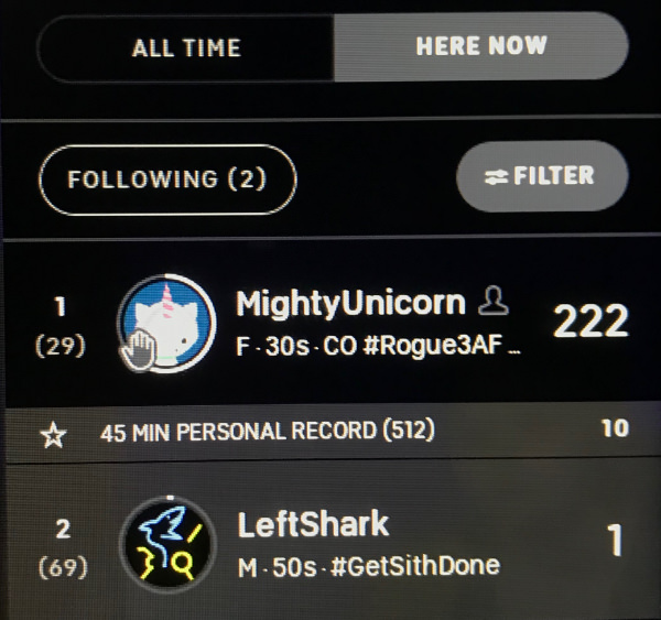
Here’s a second screen shot that illustrates a few other elements of the leaderboard. First, instead of seeing all riders, you are looking at a list of those “Here now” (a distinction made for on-demand rides). Here now, as the name suggests, shows riders that are doing the on-demand ride the same time you are. Now, not all riders on an on-demand ride are at the same point of the ride, but we’ll get to that.

In addition to showing the “here now” riders, this list is further filtered to the subset of riders that I am following. In this case, the list is now limited to just two riders, myself and Mighty Unicorn. You can see next to Mighty Unicorn’s name the outline of a person (or, at least, a bust), which indicates that I am following her.

Before I look at what we can see in the other riders’ line, let me review my own data. I am in second place in the filtered list (of two riders). I am also 69th among riders who are “here now”. The clock circle around my avatar indicate that I have only just begun the ride (maybe a minute or so into it, it’s hard to tell exactly). On the right of my leaderboard line, the number 1 indicates that I’ve generated only 1kj on my ride so far.

Just above my leaderboard line is my PR line. It shows that my PR for this length of ride (which happens to be 45 minutes) is 512, and at this point in my PR-setting ride, I’d already generated 10kj.

Let’s take a look at what we see on Mighty Unicorn’s leaderboard line (again, left to right).

First, you see the number 1 and (29). That indicates that she’s in first place in the filtered list (of people I follow) and 29th in the list of people doing the ride at the moment. (For comparison, I’m second on the filtered list, but 69th in the unfiltered list. It is not shown on this display the total number of people on the unfiltered list.)

To the right of these two numbers is Unicorn’s avatar. Notice the hand icon superimposed on the avatar. This indicates that Unicorn has high-fived me. If I tap the avatar, I will high-five her back, and the hand icon will disappear. I can high-five Unicorn or any other rider –even if I haven’t been high-fived myself– by tapping on her icon. Once you have high-fived someone, there is a waiting period before you can high-five again. I haven’t heard the phrase “high-five spam” used, but that’s what we’d call it if it were a thing. The delay is there to try to help us avoid annoying each other with repeated high-fives.

You can also see that the white “clock” ring around Mighty Unicorn is much more filled in than mine. It’s hard to see exactly how filled in it is because of the hand icon, but it looks like she is about 2/3rds through the ride. So, how does my 1kj effort at, say, one minute compare with her 222kj at, say, 35 minutes? There’s no way to directly compare those, unfortunately, so it is difficult to tell how you’re doing against others in an on-demand ride unless you start at more or less the same time.

Decoding the Leaderboard

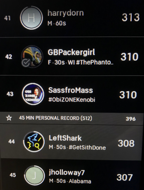
Finally, let’s look at the leaderboard near the end of a ride, and decode the information.

Again, I’ll start with myself, now in 44th position (among the riders “riding now”). The circle clock tells you I’m about 3/4th done with the ride, the 308kj I have generated is behind my PR pace of 396. (You can also tell at a glance that I’m behind my PR pace, because the PR bar is above my leaderboard entry.)

In 41st place, at the top of the image, is “harrydorn”, who looks to be just a couple minutes away from finishing. He’s 5kj ahead of me (313 vs 308), so will I pass him? It’s hard to say, but given that I probably have ten more minutes or so than he does left, my guess is yes, I will. I can’t be more exact than that. (Incidentally, if I click on harrydorn’s name instead of his avatar, I’ll see his current resistance and RPMs, which is handy if, say, I’m slightly ahead and want to make sure I can hold off a surge).

In 42nd place is “BGPackergirl”. You can see that there is a checkmark superimposed on her avatar. This indicates that she has finished her ride. Her final output is 310, and will not continue to increase. You can also see that her avatar is slightly dimmed, which indicates that she has logged out of Peloton. Note that you can high-five a rider who has finished (checkmark but not dimmed), but you can’t high-five a rider who has logged out (dimmed avatar).

Next is “SassfroMass”, in 43rd place. Sass (can I call you Sass?) also has 310 kj and looks to be just about finished with his (her?) ride. The checkmark hasn’t appeared, so he’s not completely finished, but the clock circle is complete so the end of the ride is probably only seconds away. Will he pass GBPackergirl to take 42nd place? Probably, but it’s not guaranteed.

Below me is “jholloway7”, with 307kj, in 45th place. Note that jholloway7’s clock is just about as complete as mine, which tells you that we started at more or less the same time and are on pace for a similar finish. My passing SassfroMass, GBPackerGirl and even harrydorn seems pretty much guaranteed, but I’m neck and neck with jholloway7 and if I’m watching the leaderboard he’s the one I need to keep my eye on.

One final note about leaderboard position on on-demand rides. Your position on the leaderboard may not be particularly meaningful, because you are being compared to other riders wherever they are on their own rides. A rider who started the ride thirty minutes earlier will probably remain ahead of you on the leaderboard up until just about the end of your ride (if you even catch them), and a rider who starts thirty minutes later than you probably will not catch up to you before you’re finished even if they’re significantly faster. The only real comparisons you can make are across riders who have all completed the ride.


So, that’s the leaderboard in a nutshell. If you have any questions or feel that I’ve left anything out, please let me know in the comments and I’ll try to address any loose threads.

Peloton’s Calibration Problem

If you’ve been a Peloton member for any length of time, you probably have been hearing about “calibration”. Not from Peloton, no. They hardly ever mention it. It is a topic in social media, though, and it seems that there is a widespread problem that Peloton may have no way of getting on top of. Potentially a couple hundred thousand of these bikes are essentially out of whack, and there’s no obvious fix.

What is meant by “calibration”?

Calibration, broadly, relates to the data coming back from the equipment that is used (either directly or as part of a calculation) to give the rider feedback on his or her efforts. Calibration could involve the measurements of cadence, heart rate, etc., but when you hear “Peloton” and “calibration” in the same sentence, it is the bike’s resistance that is the topic.

If you need a quick refresher on cadence, resistance, and the other Peloton metrics, click over to this explanation of Peloton cadence, resistance, and output.

Resistance is the measurement of how difficult it is to turn the Peloton flywheel, and is displayed as a percentage. You’d think that this would be essentially linear, with 0 being no resistance and 100 being complete resistance, and that 50 resistance is twice as strong as 25 resistance. If that were the case, this would be a fairly short post.

Resistance, the mystery metric

What’s really important to understand is that resistance is at the heart of pretty much everything else that is measured (besides time and heart rate). I’m speaking specifically of power generated (watts), work done (kilojoules) and calories burned. These metrics (particularly the second) are the means by which Peloton riders compare themselves to one another. If resistance is not accurate, then there isn’t much left in the metrics you can trust.

So, how reliable is the resistance number? That is the million dollar question. There is evidence to suggest that some bike’s resistance numbers are questionable. In fact, there is far more evidence to show that bikes’ resistance numbers vary greatly than there is evidence that there is any uniformity to resistance at all.

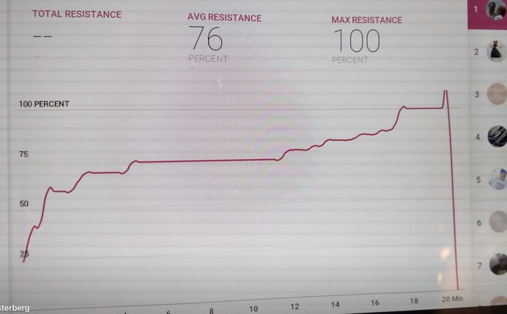
Graph showing 100% resistance - and more
This user rode more than two minutes at 100% resistance (and, evidently a short time ABOVE 100%)

Exhibit A: Social media posts in which people talk about how challenging a ride based on how many times they got to 100 resistance. Now, by definition, 100% resistance means that the wheel is completely resisted. That is, it cannot be turned. If it can be turned, then it is by definition not fully resisted. Yet notice the results graph in the accompanying photo in which the rider apparently rides for two minutes at 100% (and then proceeds to exceed 100%, at which point I guess the bike should actually be forcing your pedals backwards, or something).

There are many anecdotes about broken bikes that show 100% regardless of how much resistance is actually added, but it’s probably safe to assume that they are a pretty small minority. If, however, there are some percentage of bikes that people can pedal at 100% resistance (with difficulty, as the proud social media posters note), it begs the question of whether your 100% resistance is the same as my 100% resistance.

Giving %110

It’s like the koan-like question: how can we be sure that when I see the color “blue”, the color I see isn’t the one that you’d call “red”? I know something is blue because it is the same color as other things that I also identify as blue. But I have never seen anything with your eyes, and I have no idea what the color blue looks like to you. I only know that something is blue because I compare it to other things I call blue, and things are only more or less blue compared to my internal frame of reference.

We face the same dilemma when it comes to resistance. Compared to the color example, it is a bit easier (but not so easy) for me to determine if your 40% resistance is the same as my 40% resistance. If it’s wildly different, then I can perceive of the difference, but if it’s close, then it’s not likely I’d be able to discriminate, say, between a few percentage points.

Resistance is futile at the Peloton mothership

I have personally ridden on about five Peloton bikes, and I’d have to say that the ones I rode in the Peloton store, my own bike at home, and my brother’s bike all felt about the same to me. The bike I rode in the Peloton studio, on the other hand, was conspicuously easier than any of the others. Yes, maybe I was pumped up for the ride at the Mothership (SO to JJ!), but I don’t think that accounts for the difference. The PRs I set that day still stand, and my next best effort isn’t close. Although I have no data to back it up, I am convinced that the bike at the Peloton studio was the “easiest” bike I’ve ridden.

This is where “calibration” comes in

This all comes back to “calibration”. Calibration is the act of accurately setting the measuring devices, and in the case of these bikes, is performed at the factory. Presumably, there can be some change over time (“drift” is what it’s called) or calibration could be affected by jostling that occurs during the delivery and installation of your bike, so the calibration tools are included with your bike when it is delivered to you. (Anybody have their bike calibrated by the installers? Didn’t think so. Anybody want those guys making adjustments on your bike? Didn’t think so.) I won’t go into the specifics of calibration, but you can do an internet search to find Peloton’s own instructional video. I’ve been through the video and, in my humble opinion, their process still includes a fair bit of subjectivity that could lead to variations even across “calibrated” bikes.

So, how do you trust that the resistance numbers (and, by extension, the all-important output numbers) are the same from bike to bike? This would seem to be nearly impossible to know. To accurately determine if the amount of effort needed to turn one bike’s flywheel is equal to the effort required for another bike one would need additional equipment, such as replacement crank arms or pedals with power meters built-in. Of course, THOSE devices would need to be calibrated, too!

As it is, I don’t believe anyone has an accurate picture of the amount of variability there are in the power calculations across bikes, and I don’t believe there is really any way that Peloton could measure and correct for this, even if they wanted to. 

The good news is that if you bear in mind that your true competitor is yourself, then none of this should really matter. Your own bike’s resistance calibration is not likely to drift significantly over time, so if you are now cranking out 30% more KJs this year over last, you can be pretty sure you’ve made some serious progress. 

As for me, I just assume that anyone ahead of me on the leaderboard needs to get their bikes calibrated.

— #LeftShark

Is the Tread What Peloton Really Needs?

Last week, fitness startup Peloton (you’ve seen their commercials) announced their second product, an Internet-connected treadmill called “Peloton Tread”. This is a pretty dramatic step (no pun intended) for the company, but (pun intended this time) are they putting their best foot forward?

I’m not an expert in the fitness industry, and I’m not even much of an athlete. That said, I’m an active (bordering on fanatical) Peloton rider and I’ve been following the company closely. I’ve become a big fan of the Peloton bike in the past six months since I worked it into my daily schedule. I’ve seen some big gains in my fitness (my doctor was very impressed) and on many days the 45 minutes I spend on the bike are the best 45 minutes of the day. The $2K cost of the bike plus the $39/month subscription, while extravagant by my tastes, has been worth every penny.

So, I’m definitely a fan, but that doesn’t mean that I necessarily agree with every move Peloton makes. And I’m not all that enthused about the Tread, at least not yet.

The New York Times wrote a very good article (What a $4,000 Treadmill Means for the Future of Gadgets) that captured many of the reservations I have, and it’s worth a read. They discuss the price ($4,000) and some of the ways in which the treadmill is different from the bike and therefore might not expect the same level of success.

On top of these observations, I would add one more. When the Peloton bike came to market, they had a model to emulate: the spin class. The Peloton bike faithfully reproduces the spin class experience (so much so that the rider of the Peloton bike is expected to set his or her own resistance via a large plastic knob, where exercise bikes costing much less will do so automatically). You can capture the Peloton bike experience in a sentence: it’s a spin class you don’t have to leave home for. For someone like me, that’s the difference between spinning and not spinning.

Is there an analog for running? Although I am not (nor have I ever been) current on exercise trends, I don’t think there are running classes, where a room full of people come together to run on treadmills, led by an instructor. My own experience with the row of treadmills at health clubs and fitness rooms is that it’s a solitary activity. Each runner has his or her earphones in and is usually watching Headline News on TV, as far as I can tell.

Peloton seems to recognize this, and even in the very first paragraph of their email announcing the Tread to current Peloton members the company asks us to look at it as more than a treadmill:

Peloton Members,

On behalf of the entire Peloton team, I am incredibly proud and honored to announce the launch of our second-ever product, the Peloton Tread™. While we believe it is absolutely the best treadmill ever created, its name and looks are a bit deceiving. Similar to the Peloton Bike™ being #morethanabike, the Peloton Tread is much, much more than a treadmill.

(continues …)

The plan, as it’s been variously described, is that a Peloton Tread workout will be more than running on a treadmill. It will be weights, isometrics as well, so that the workout is not just lower body and cardio (which the Peloton already covers as well). Even the first promotional video, seen on the Peloton website, has as many scenes of our fitness model working out OFF the treadmill. The photo accompanying this article is striking to me because the model isn’t even on the treadmill, instead using it as a $4000 monitor stand.

I am having a hard time getting my head around it: the pitch for the super-expensive treadmill contains the assurance —up front and center— that you will be doing lots of things other than running on the treadmill. It’s a big piece of equipment to be used as a video monitor. And speaking of that, I find it somewhat inconvenient to use my Peloton bike for the “beyond the ride” (off-bike stretches and dumbbell) exercises because the bike itself is often in the way. It’s hard to lie on the floor and try to follow the instructor’s lesson when there’s a large exercise bike in the way. I don’t see that situation being much improved with the Tread.

I hope I’m wrong about that. The “beyond the ride” feature is very compelling and I hope that the new Tread workouts spill over to bike users as well. In the meantime, I am going to be following the rollout of the Tread with some trepidation. Peloton is a quick-growing company with an exciting product in the bike and a lot of potential, and this is a major step that I’m not sure is in the direction that I think they should be going.

What direction do I think they should be going in? I’m glad you asked. If you read my post from last week, Analytics vs. Analysis, you may already know where I’m going. If you haven’t read it, well, you should. Go ahead. I’ll wait. Remember to click on the ad at the bottom and buy whatever they’re selling you, too. Thanks.

To me, the thing that is missing from the Peloton experience is connection. Despite the fact that I’m watching live video, and competing on the leaderboard against real people, I am essentially on my own in pursuing my fitness goals. While the instructors occasionally shout out the usernames of some riders (“Looking good, CrunchyFrog!”), they are really not in a position, with five hundred or more people in the class, to give personalized advice to anyone (even if a spot check of a rider’s stats would be enough to go on). This, I believe, is the next frontier in at-home fitness classes, and it’s going to be a hard one to cross.

What would make this such a challenge is that giving personalized advice is not something that I’ve seen any computer algorithms do well. My Apple Watch sets a calorie goal for me, and if I meet the goal, it suggests a higher goal. That’s not intelligent advice; it’s a five line computer program from programming 101. As I mention in my post from last week, it’s easy to report that I ran 1.71 miles today, but is 1.71 miles good? Will it improve my fitness? Depending on my physical condition 1.71 might be a monumental accomplishment or it might not be noteworthy at all.

Despite all of the metrics and connectivity that the 21st century affords, in the end I am still my own coach (not to mention nutritionist and medic, but one thing at a time…). It is still up to me to understand what all the analytics tell me, to assess my progress toward my goals and to create and refine my plan for getting there. This is where Peloton could really change the game.

Unfortunately, it seems to me that providing these sorts of services would require a lot of manpower. It would be necessary for someone at Peloton (not necessarily the class instructor, but someone) to actually know who I am, what my fitness history and goals are as well as information such as injuries and other limiting factors. My personal coach would also need to be qualified to give me advice, which seems obvious but in practical terms means that the company would not only need to hire people but that these people have special training. I don’t know how many people it takes to produce one segment of Peloton programming, but once the studio is set up I can’t imagine it requires more than two or three. So whether there’s 100 or 10,000 people taking the ride, the investment is fixed (and low). The sort of involvement I’m talking about would require maybe one person for everyone twenty or thirty members, so the more riders you have, the more staff you need. It is not a great equation for making money.

I hope the Tread is a success for Peloton. I hope that the “beyond the ride” offerings continue to evolve and that they’re able to provide a complete home fitness solution. In my humble opinion, it’s going to require offering personalized guidance to their customers, and that’s an expensive proposition. When I see the Tread, I can’t help but feel that they’re avoiding this inconvenient truth and instead attempting to recreate their bike success with a treadmill. Time will tell if this is enough to keep them going.


UPDATE: Entrepreneur Magazine posted an interesting article about the future of Peloton, and the Tread’s place in it. It’s worth a read.

Here’s my background on the subject of this essay, so you can decide how much credence you want to put into the opinions I present.

I am not an expert in the area of physical fitness, and I have no inside information on this company. I don’t have a gym membership, and generally don’t buy really expensive things. However, I do own a Peloton bike and have been a Peloton member for about half a year. I’ve been following the company closely, and have read most everything I can find published about Peloton. Am I right about the Tread? Time will tell.

The Difference Between Analytics and Analysis

November progress report, noting that I worked out one fewer day compared to October

I am something of a Peloton fanatic. You can find me (by my nom du guerre “LeftShark”) somewhere on a leaderboard every single morning. Coincidentally, I’m also an analytics junkie, and one of my favorite parts of a workout is afterward, when I crunch the numbers to see how I’m doing. Peloton provides all sorts of graphs and metrics, and it’s great to be able to wade through and see my progress over the weeks and months. As a bonus, after the first week of the month, Peloton emails me a review of the prior month.

At the beginning of December, I received my November report. It told me that I had worked out thirty days in November. Below the calendar that had every day filled in, there was a one-sentence commentary on my performance:

This is 1 less day than last month

If you’re thinking: “It should be 1 fewer day”, I applaud your grammar. Still, my point in bringing this up is that October has 31 days, and November only 30. So if I work out every single day for both months, it is inescapable that I will work out one fewer day in November.

When I first read this attempt at insight, it made me laugh, but it also disappointed me a little, because it’s a glaring example of a modern-day problem, that of Analytics vs. Analysis, and is a reminder that we have plenty of the former and far too little of the latter.

For most of human history, a lack of sufficient information was a huge impediment to decision making and planning. By contrast, today we often find ourselves with far more data than we can manage. Pages and pages of data. The problem is no longer that we don’t have enough information, it’s that we have so much information that we don’t know what to make of it. The of-used but suitable metaphor for the attempt to gain insights from a flood of data is “drinking from the firehose.” The providers of the data often try to do some number crunching for us, to help us draw conclusions and help plan, which is where “data” leaves off and “analytics” begins.

This year I played Yahoo’s Fantasy Football. After each week’s games, Yahoo would send me a recap of my team’s performance. At first, I was really delighted with the analysis, because it was written in a dramatic, sports-page style: “Jay Ajayi destroyed the competition with 15 runs for 100 yards,” and such. For the first couple of weeks, I looked forward to this recap, but after a couple of weeks, I started to spot patterns in the report. By the middle of the season, I had stopped reading. Most of the “analysis” given was actually very superficial, based on perhaps one number, using canned phrases that more often than not didn’t reflect reality in any meaningful. Some players were alternately praised and criticized in the same report depending on which statistic the algorithm was comparing at that moment.

Of course, I never thought for a minute that there was an actual human being at Yahoo covering my fantasy football team, and I don’t think that anyone at Peloton is reviewing my performance data and writing my monthly report. But the superficiality of this so-called “analysis” shows me how far we still have to go. With the power of computers, analytics are easy. Analytics is just sums and averages and plotting changes over time. It’s the analysis that’s hard, and the part that no one seems to be able to automate.

Professionally, I see this all the time, when dealing with website analytics. Say a web page has a “bounce rate” of 80%. (“Bounce rate” is how frequently a visitor to the web page leaves the site without visiting any other pages). Is that a good thing, or a bad thing? Conventional wisdom is that it’s a bad thing — your visitor is leaving! But what if the visitor found the information they’re looking for? A bounce rate that high might indicate that your web page is perfect. So, it’s either terrible or terrific, and the analytics is not going to tell you which. For that you still need a human, who can take into account the intent of the web page and nuances that would help understand the dynamics of a high bounce rate.

Algorithm-based analysis has gotten better over the years, to be sure, and a carefully written algorithm can lead to insights, even without human intervention. Indeed, a lot of the tasks involved in human-powered analysis are the sorts of things that computers are good at (comparing trends, etc) and it is only a matter of time until the computer-generated analysis become much more valuable. Until then, we need to not confuse analytics with analysis, and we must not content ourselves with the former when we really need the latter, despite the cool charts and infographics that companies are always trying to use to impress us.

I appreciate the analytics. More analysis, please.

Here’s my background on the subject of this essay, so you can decide how much credence you want to put into the opinions I present.

I have about twenty years or so experience working on the web, from back before the days of web analytics (and Google, for that matter). Somewhere in my file cabinet is the Google Analytics IQ certification. I have also spent at least one Saturday poring over my stats from Peloton and Strava, and for better or worse, can tell you on any given day how I’m doing against my weekly and yearly goals.

What is this all about?

I created this site in January, 2018 as a place where I could write on a variety of topics. If someone such as yourself reads these posts and gets something out of them, so much the better, but the principal reason for creating the site is just to have a place to write, so I hope you understand if it turns into a collection of seemingly random thoughts on disjointed topics.

I believe that writing is one of those skills that has to be used frequently if one is to remain proficient. Unfortunately, most of the writing I do on a day-by-day basis is in the form of emails and texts, generally very short and usually part of a conversation. This is quite different from essay writing, which is what I’m hoping to practice here on this site. Again, I hope that someone will read these posts and that they provoke thought, or entertain, or inform. But even if they don’t, if I can continue to write, the site will serve its purpose.

So, what will I be writing about? As I said before, the goal of the site is to give me a place to write, and writing itself is the goal, so I’m not going to limit myself too much in terms of subjects. I will no doubt be writing mostly about topics that interest me, such as technology (particularly the Internet, where I work) and society (I am an economist by training, and am interested in what is now called “behavioral economics”). Chances are a few book reviews and other things are going to creep in as well.

So, if you’re reading this, thank you. Ultimately, the purpose of writing is to express ideas to others, and it is nice to think that there is someone out there! I will do my best to write well, and hopefully will pick interesting topics that contribute something to the conversation.

Thanks again, for your interest, and I’m always happy to get feedback.

—Brygs